![]() In the digital age, the journey from creating artwork on a computer to seeing it printed on paper involves a fascinating transformation that hinges on the fundamental differences between color models. Whether you’re a graphic designer, photographer, or hobbyist, understanding these differences is important for ensuring that your digital designs look just as stunning in print as they do on your screen. This blog delves into the intricacies of additive and subtractive color models, shedding light on how these principles affect your work from pixel to paper. Our team at Joseph Merritt and Company is here to assist with all your printing questions, ensuring your designs are perfectly executed.
In the digital age, the journey from creating artwork on a computer to seeing it printed on paper involves a fascinating transformation that hinges on the fundamental differences between color models. Whether you’re a graphic designer, photographer, or hobbyist, understanding these differences is important for ensuring that your digital designs look just as stunning in print as they do on your screen. This blog delves into the intricacies of additive and subtractive color models, shedding light on how these principles affect your work from pixel to paper. Our team at Joseph Merritt and Company is here to assist with all your printing questions, ensuring your designs are perfectly executed.
Additive Color: The World of Digital Displays
Computer monitors, televisions, and other digital screens rely on the additive color model to produce the vibrant images we see. This model starts with black and adds colors through light emission. Here’s a closer look at how it works:
- Primary Colors: The additive primary colors are red, green, and blue (RGB). These are the building blocks of all colors on a digital display.
- Color Mixing: By varying the intensity of each of the primary colors, a screen can produce the entire visible spectrum. When red, green, and blue light are combined at full intensity, they create white light. Conversely, the absence of all three colors results in black.
- Brightness and Light: Adding more color (light) in the additive model results in lighter and brighter hues. For instance, combining red and green light yields yellow, adding blue to this mix would lighten the color further, moving towards white.
Subtractive Color: The Realm of Printing
When it comes to printing, the subtractive color model takes center stage. This model operates on a completely different principle compared to its additive counterpart:
- Primary Colors: The subtractive primary colors are cyan, magenta, and yellow (CMY). These are used in various combinations to absorb (subtract) light, thereby producing different colors.
- Color Mixing: In subtractive color mixing, combining these inks results in darker colors. For example, cyan and magenta create blue, magenta and yellow produce red, and cyan and yellow yield green. When all three are combined, they absorb most of the light and produce a rich black.
- Darkness and Ink: Adding more ink (color) in the subtractive model results in darker tones. This is because each layer of ink absorbs certain wavelengths of light, reducing the overall light reflected back to our eyes.
Bridging the Gap: Practical Tips for Accurate Print Colors
Understanding the differences between these color models is crucial for anyone working across digital and print mediums. Here are some practical tips to help ensure that your printed work matches your digital design as closely as possible:
- Color Calibration: Regularly calibrate your monitor to ensure the colors displayed are as accurate as possible. This step is vital for creating a reliable reference point.
- Use CMYK Mode: When designing for print, work in CMYK mode from the start. This will give you a more accurate representation of how your colors will look when printed.
- Proofing: Always request a proof from your printer before committing to the final print run. This allows you to make any necessary adjustments based on how the colors actually appear on paper.
- Pantone Colors: For critical color matching, consider using Pantone colors, which are standardized inks that ensure consistency across different print jobs and materials.
Conclusion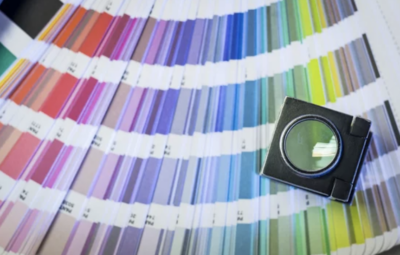
Navigating the transition from digital design to printed material involves understanding the fundamental differences between the additive color model used by screens and the subtractive color model employed by printers. By mastering these concepts and employing best practices in your workflow, you can achieve stunning, accurate results that bring your vision to life on both pixel and paper. Whether you’re creating vibrant posters, detailed brochures, or stunning photographs, appreciating the science of color will always enhance the quality and fidelity of your work.
For any further assistance with your printing needs and to ensure the best quality outcomes, Joseph Merritt and Company is your trusted partner. Our expertise and dedication to excellence will help you achieve the perfect print every time.